University of Michigan Alumni Website Redesign
With the launch of a Digital-First strategy, the Alumni Association is transforming its communications channels and platforms to increase digital engagement. Relevance and reach for our recent grads and digital natives is a big push in this direction. One of the ways they wished to create better engagement for the Alumnus online is through better UX design.
-
The Alumnus is printed as a magazine quarterly, and we also have online presence. However, the engagement online still needs to grow.
-
• Create a basic design mock-up with a one page summary on how you’d redesign the landing page for the magazine.
• Timeline : Two weeks
Competitive Analysis
Both the contextual research and competitive analysis focused on universities at the Local, National and International level that can be a direct comparison to The University.
-
University: Alumni size per school/study, location, business info, etc.
Alumni : Demographics, preferences, careers, location etc.
Website: Information-related data such as features, articles, resources, if they have a mobile app etc.
Marketing: Strategic approach, SEO tools, use of channels, marketing campaigns.
UI Design Mockups
-
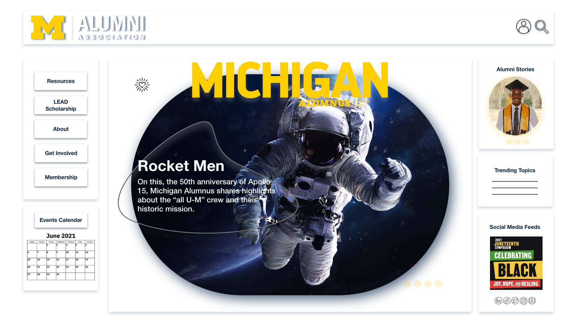
The UI elements in the ‘Historic User Behavior Aesthetic’ mock-up are situated on the page, similar to social networking sites that emerged in the early 2000’s….
1. Minimal top menu bar with essential interactive elements such as the logo/home, profile and search icons.
2. Secondary navigation tabs/drop-down menu to the side of the page in an effort not to block the view of central content…
…6 key UI design decisions total
-
Now that digital natives are now entering their late 20s early 40’s - leisure is king. Besides the invention of the iPhone and the boom of smart phones in 2007, one of the biggest UX behavioral interventions in the last decade (from 2009 -2019) was the creation and adaptation of the ‘Netflix scroll’, and or the combination of the ‘on hoover media animation’ divs and vertical carousel scroll.
1. Minimal header with only the essential user tasks such as profile shortcut, search and home drop down menu element.
2. Secondary navigation condescends to hamburger drop down or side appearing menu…
…6 key UI design decisions total
Summary
With the analysis of all the research insights completed the next step was to create the UI wireframes. Interestingly enough two distinct design themes emerged which lead me to create and recommend two possible and very different website journeys.
The final report has the interactive link where both UI sites showcase a “typical” session. In addition to the full written recommendation report and rational.
-
Digital natives are both the creators and curators of the current digital ecosystem.
• Nostalgia still works at getting site novices to adapt to the site and become return users.
• They value individuality and are used to creating and maintaining every step of their own user experience and journey, from privacy to online communities once on a platform.
• They use Apps!
The pivot to appeal to digital natives would be the best design intervention to help increase the Associations digital engagement, and in order to cater to this demographic it is important to remember:
-
• Contextual Research
• Competitive Analysis
• User Surveys


